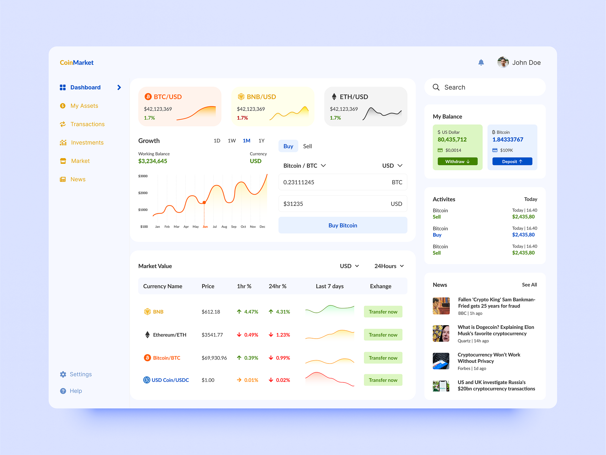
Dashboards UI Design
Dashboards are the primary interface users see when they sign up for an application. Their design plays a critical role in shaping a user’s first impression, influencing whether they continue using the product or leave. In this case, I focused on addressing common UI design mistakes and creating dashboards that are user-friendly, visually appealing, and accessible.
Common UI Design Challenges and Solutions
1. Overcrowded Visual Appearance
- Challenge: Dashboards with excessive or poorly organized content overwhelm users and reduce usability.
- Solution: Implemented minimalist layouts guided by design principles to create a clean, scannable interface. Used white space effectively to enhance focus and readability.
2. Poor Typography Hierarchy
- Challenge: Inconsistent typography makes content difficult to read and navigate.
- Solution: Designed typography with well-proportioned font sizes to distinguish titles, paragraphs, and captions. Organized text hierarchically, improving readability and ensuring users can easily scan content.
3. Accessibility Design
- Challenge: Limited accessibility prevents a wide range of users from interacting with the dashboard.
- Solution: Applied WCAG-compliant contrast ratios between text and background. Ensured all users, regardless of ability, could engage with the content effortlessly.
The following designs have been tested on real users to ensure they effectively address real-life problems.


Other Similar Works

Music App UI Design
Music player app UI design, focusedon usability and visual appeal. From brainstorming to Figma mockups, I crafted an intuitive, user-friendly experience.

CRM SaaS UI Design
CRM UI design concept: Addresses common UX/UI issues based on user observation to enhance user experience and interface efficiency.