Case study · Mobile app · Insurance
Rebuilding Confusion Into a Guided Flow
Staff documenting car-wreck incidents on scene couldn’t tell what to tap next. I redesigned the app’s flow and UI into a guided photo-capture experience without touching the backend.
Role
Product designer (Contract)
Scope
Mobile app (React), user flows, information architecture, UI
Status
Shipped
Constraints
Material UI components library only
Platform
Phone and tablet, used on scene
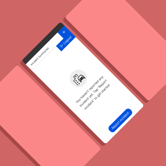
At a glance
Problem
The flow followed the database, not the user
Buttons were grouped inconsistently and screens gave no guidance on where to tap or what came next — on scene, under pressure.
What I did
A guided multi-photo capture loop
An upload box for gallery or camera, a familiar carousel to review and edit shots, and clear upload states — all inside Material UI.
Outcome
Shipped, and saved development time
The client said the photo capture concept saved them development time while keeping the flow easy to follow.
The problem
A mobile app used by staff to document car-wreck incidents involving vehicle damage. Users could upload vehicle registration and insurance documents, then submit evidence packages to insurance companies. The app was already built but proved difficult to use. The user flow followed the database, not the human logic: create an incident, enter details, upload a license, and take photos of the incident.
Buttons were grouped inconsistently, with no clear order, and screens offered no guidance on where to tap and what came next. Staff used the app on scene, from phone or tablet. I joined to fix the UI and make it usable without tampering with the backend or component library.
My role
I was brought in to improve the UI and user flow of an existing app. My role was to propose design solutions for the developer to approve. I had full creative control to design, test, and present my solutions to the project manager and developer for discussion.
The multi-photo capture loop
Designing the flow for taking photos and extracting details from them was the hardest task. Users need to take many photos per document and per incident, which raised a concern on the development side: how to create a UI that was understandable for users but manageable on the backend.
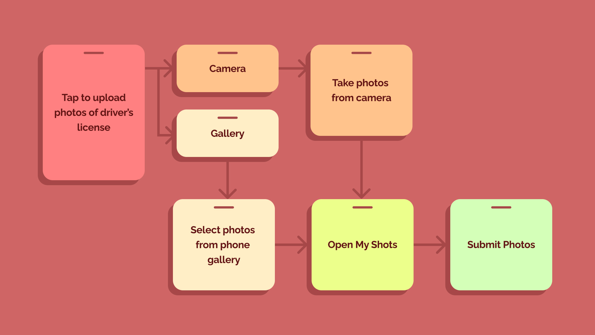
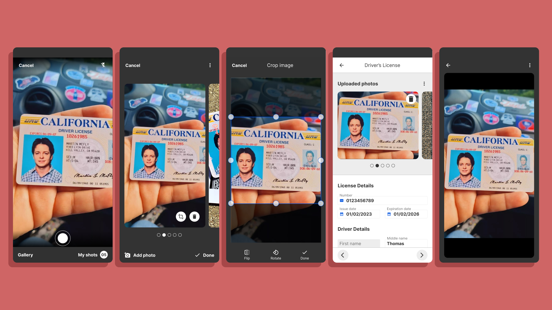
The developer didn’t want to change the backend, so we agreed to solve it on the frontend. I proposed an upload-like box that lets users tap and choose between uploading from the gallery, taking photos with the phone camera, or canceling. Gallery upload is straightforward: select photos, upload, edit, submit. The in-app camera lets users shoot as many frames as needed, then review and edit them under “My Shots” before submitting.
Reviewing photos in “My Shots” needed research and thought. Staff use the app outside, at the incident, so everything has to be fast and easy, with no confusion or cognitive load. A carousel worked best: it’s familiar from social media, so everyone knows how to slide left or right to review and edit. Each edited photo is marked with an icon, so users can check their shots quickly and submit when done.
Working inside the system
Each added vehicle needs three documents: license, registration and insurance, each with its own upload state shown on screen. Readability was crucial. In a limited environment — no custom UI elements, brand colors only — I used Material icons, color theory and visual hierarchy to design the upload states.
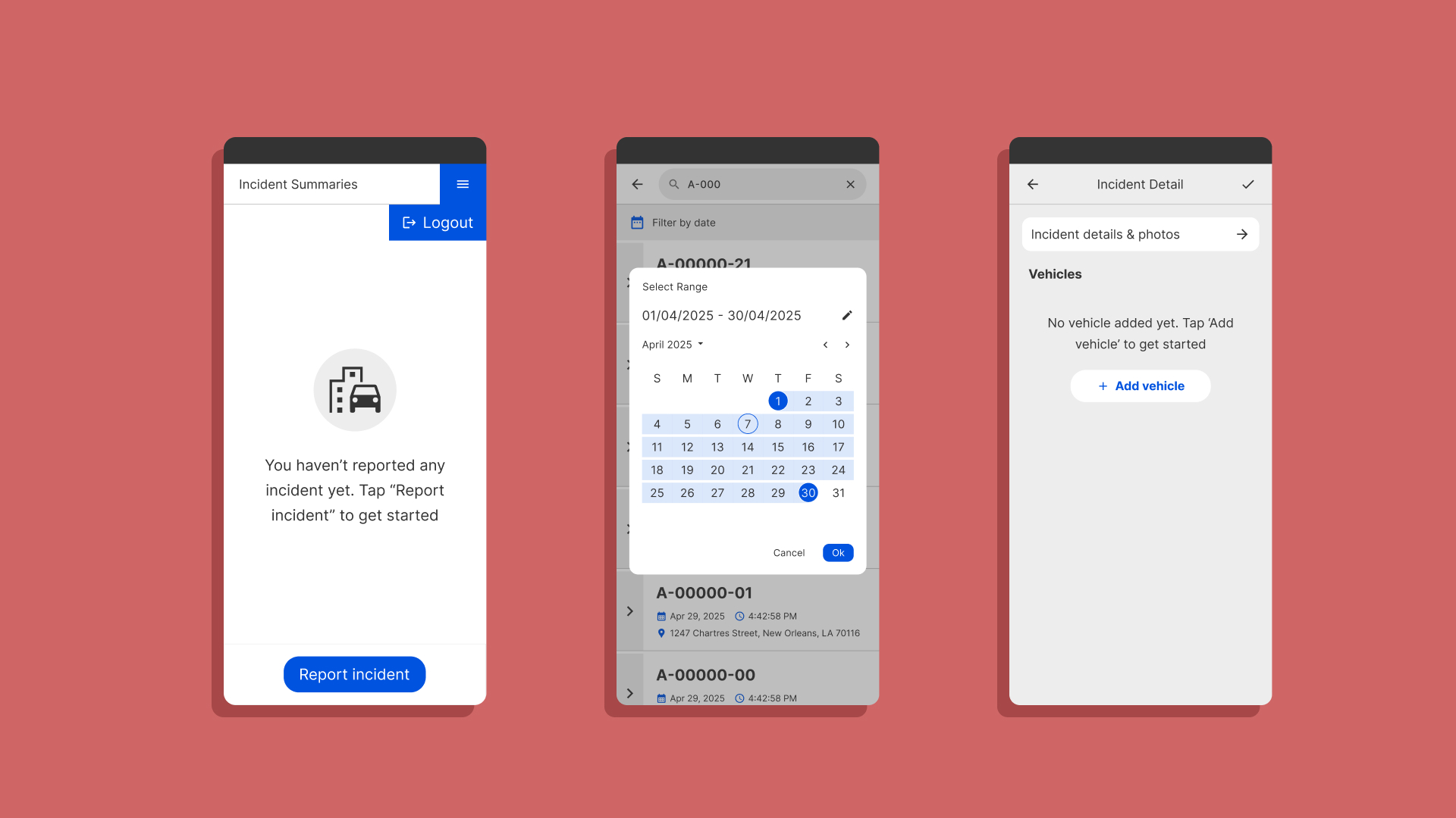
Another element that improved the flow was search. I hid the search bar behind a search icon: tapping it opens the bar with a date filter underneath and a blank screen. Typing shows incident results, which can be filtered by most recent or a custom date range.
Where it stands
“You did a great job and we are very grateful for it. Your concept for license photo capture and submission saved us good developing time while maintaining a functional, easy to follow user flow!”
Client — the app is shipped and in internal use
The final screens
The product is shipped and in use. Because it’s an internal app, I can’t download and test it myself, but the client’s feedback above speaks to the result.
Designing trust into a vehicle service platform →
Have a complex product that needs to feel simple?
Tell me about it. Full case studies are available on request.